We are open from Thursday to Sunday: 3:30 PM till 7:30 PM

03.01.2026 - 05.24.2026 Aneta Grzeszykowska. Out of the blue

05.04.2026 Closed for Easter

INVESTIGATIONS FOR EXPERIMENTAL GRAPHICS

Out of the blue

Investigation n.3 – 28/03/2026

Tre corpi

Investigation n.1 – 29/05/2025

AMORE CHIAMA COLORE

Investigation n.2 – 13/11/2025

The graphic project developed for Out of the blue, the first solo exhibition in Italy by Aneta Grzeszykowska at Fondazione D’ARC, was conceived as a conceptual extension of the curatorial framework, translating into visual and material form the reflection on temporality, identity, and the construction of the image that runs through the entire exhibition.

The intervention unfolds through two main devices,, the exhibition text and the postcards conceived not as simple communication tools but as integral parts of the exhibition experience.

The exhibition text is conceived as a temporal score. Its graphic structure draws on an archival aesthetic contaminated by the form of the cinematic script: a rigorous, almost notarial layout in which the typographic arrangement and the sequence of interview dates interrupt the linearity of reading, transforming the page into a sequence. The dates are not mere chronological references, but coordinates that activate a dimension of montage, evoking both the sedimentation of the archive and the rhythm of film language.

This structure directly dialogues with works such as Clock, in which the artist’s body becomes a living measure of time, multiplying itself over the course of twelve hours until duration is transformed into a physical and sonic experience.

The postcards represent the material translation of several central elements of the artist’s research. Their multi-layered construction integrates a sheet of glossy paper superimposed on the image, an element that alludes to skin, a recurring material and concept in series such as Skinformer. The transparency neither fully conceals nor protects; instead, it introduces a tactile and visual distance, inviting a gesture of discovery that recalls the tension between surface and identity, between the visible and the latent.

The metal rivet that holds the different layers together functions both as a structural and symbolic element. Its industrial character recalls the safety pins and needles used by the artist. The editorial object thus becomes a portable fragment of the exhibition.

The entire graphic project also draws on a reference to the tradition of Polish cinema, which pioneered a visually striking graphic language at times apparently grotesque, yet deeply symbolic. As in those posters, the image does not simply describe: it generates a perceptual shift, an ambiguous attraction that conceals a deeper conceptual stratification.

The exhibition text and the postcardsserve as formal tools through which the exhibition’s themes are visually translated therefore, share the same principle: transforming the printed support into a critical device. The archive, skin, montage, and assemblage become formal tools through which the themes of the exhibition are translated visually.

The graphic project developed for AMORE CHIAMA COLORE stems from a reflection on the role of black and white as autonomous chromatic tools, capable of building rhythm, balance, and visual hierarchy. In contrast with the expectation of “color” as something lively and saturated, here color is interpreted as structure: white as a breathing space, black as weight and grounding.

At the foundation of the composition lies a rigorous grid, built according to the logic and discipline typical of the systemic design developed by Josef Müller-Brockmann and the entire Swiss school. The grid is not a constraint but a method: a tool that brings order, coherence, and continuity to the pages, facilitating the distribution of elements and guiding the reader’s eye along a controlled path.

The layout becomes a process of balancing structure and dynamism, in which the module determines the position and function of each piece of content.

Within this highly rational visual architecture, a powder-pink sheet is intentionally introduced: an element that breaks the monochromatic linearity to offer a different kind of breathing space, an accent capable of creating contrast and rhythm. This chromatic insert, though minimal, interacts with the modular structure and enriches it, offering a visual pause that emphasizes the narrative nature of the project and enhances the perception of its contents.

The entire project is built on these principles: essentiality as a conscious choice, reduction as a means to let meaning emerge, and the grid as an invisible architecture that supports the message. The result is a visual language reflecting a dialogue between emotion and order, between the concept of “color” and its reinterpretation through the purity of black and white, enhanced by a carefully calibrated chromatic intervention that brings value to the spaces, relationships, and internal rhythm of the pages.

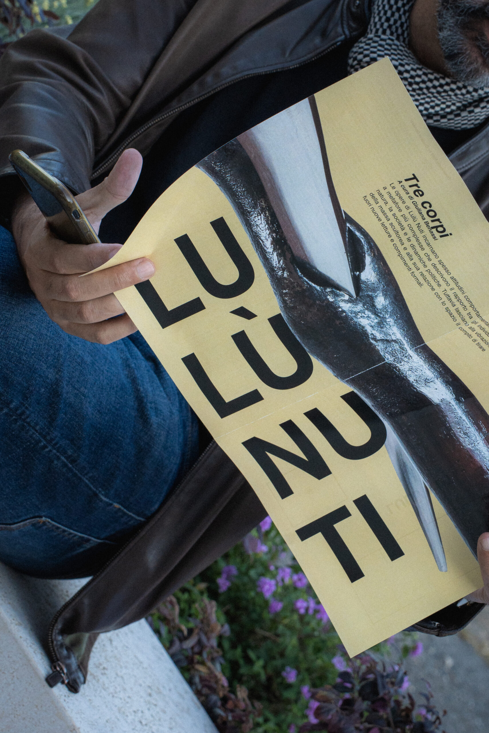
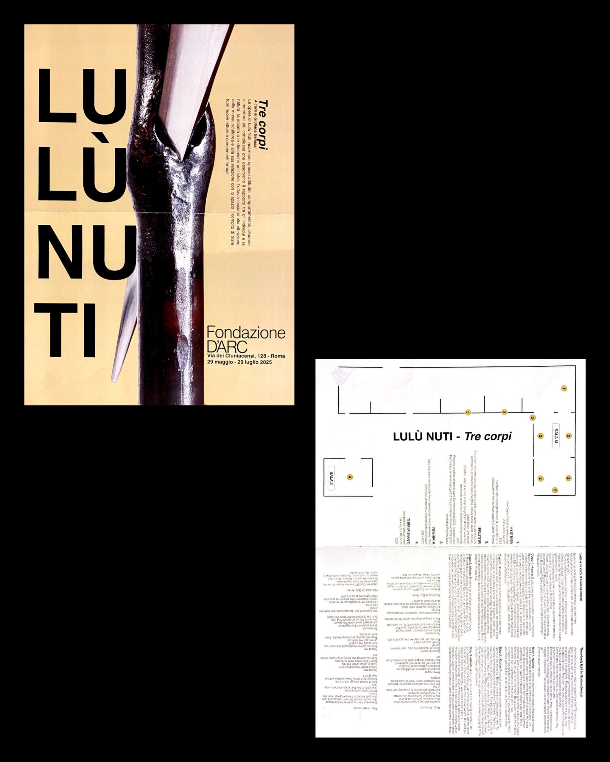
The graphic project developed for Lulù Nuti’s exhibition stems from a reflection on the concept of the fragment: not the artwork in its entirety, but a detail, a point of tension, a magnification that reveals what remains hidden at real scale. The central image is not a complete reproduction, but a surgical extraction from the artwork, an extreme close-up of the material, where metal, surfaces, and engravings become landscape.
This act of zooming in is not purely aesthetic: it is a conceptual choice. Bringing the gaze closer means entering the artist’s practice, the physicality of her work, the violence and precision of the gesture.

The graphic composition is built around this fragment. The monumental, sectioned, vertical typography does not merely describe but engraves the space, reflecting the very process behind Lulù Nuti’s works: interfering, compressing, putting matter under pressure rather than simply presenting it.

The background is not conceived as a neutral backdrop but as an identity field. The Foundation’s gold becomes an active surface, an institutional element that does not simply act as support but converses with the metallic material of the artwork, amplifying its weight, density, and physical presence. It is not a decorative gold, but a functional one: a visual base that anchors the institution’s identity while enhancing the sculptural nature of the work.

The decision to isolate a detail and construct the entire visual system around it responds to a precise idea: shifting attention from iconography to material, from the recognizable form to its internal tension.

Even the placement of the text follows this logic. The artist’s name is not simply read but traversed in a fragmented, non-linear manner, forcing the eye to move through the graphic space as one moves before the artworks: through disorientation, proximity, and gradual approach.

The result is a visual system built through extraction and contrast, where the fragment becomes a threshold and the Foundation’s identity is not a frame but an integral part of the narrative.